Color Grading: The Teal and Orange (Analysis of a Look)


In this article I'm going to analyze the most famous and discussed look ever in the field of color grading: Teal and Orange.
Whether you're working in Premiere Pro, Final Cut, DaVinci Resolve or any other software, teal and orange is a look you've surely tried to replicate over and over again.
Why do I say "the most famous look"?
Because, when I talk about color grading with any person who works in the world of video, teal and orange is the first look that pops into mind and believe me, everyone talks about it with huge admiration.
Let's not overlook this "small" detail: there are companies that have built an empire on teal and orange.
Why does it work?
From my perspective, the teal and orange look works for 2 main reasons:
1. Harmony and interaction between colors
Teal and orange is a look that comes from using 2 complementary colors: teal and orange.
What are complementary colors?
Complementary colors are nothing more than 2 colors facing each other in the color wheel.
You should know that the use of complementary colors always arouses a lot of interest in our eyes.

Complementary colors are sometimes referred to as a recent discovery, something new, but they have actually been used for a very long time.
Remember that Van Gogh frequently used complementary colors in his works.
2. Warm-cold contrast
In reality, the warm-cold contrast is a direct consequence of using complementary colors.
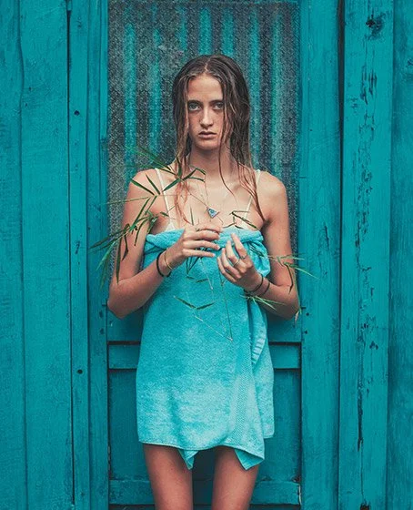
The warm-cold contrast is nothing more than the interaction between the warm tones of the human complexion and the cool tones of the background.
This kind of contrast helps massively to detach the actors from the background, making them stand out to our eyes.
Understanding when to use this look
As much as it's a look that really works very well, you have to understand when it's appropriate to choose it and when not.
The teal and orange look, for example, is widely used in action movies.
If you've shot a nature documentary, teal and orange is definitely a poor look as it will completely distort the nature of your project.
It's then the colorist's job to make the client understands why such a look wouldn't work and direct them to a look that would better suit the nature of that particular project.
Did it become tired?
From my personal perspective: yes, it became tired.
I think this look has been a little too overused over the years and has also limited many projects from a creative standpoint.
How so?
I think for a long time the teal and orange look was seen as the "safe" look to go for, without even considering other options.
It’s probable that many projects could have had much more interesting and sophisticated looks if we hadn't focused on teal and orange right away.
Conclusion
1 - When it comes to color grading, remember that teal and orange is just one of the many looks a colorist can go in and recreate, and it doesn't necessarily work on your project.
2 - If you're on the fence about which look to choose for your project, talk to the colorist.
I, for example, try to gather as much information as possible from my clients. This allows me to fully understand their vision and come up with different draft looks to choose from.
Once you have selected the draft look that most closely matches their vision, you can then proceed to fully customize the look according to their eventual requests.
Did you find this article helpful? Buy me a virtual coffee!


Sign up to my Newsletter to get your Free Colorist Pack!
You'll also receive updates on upcoming Products, Giveaways, Exclusive Content and more!